Project Overview
Transforming Lives Through Learning
Stakeholders from Community Resource, a fictional non profit organization, received a massive grant that allowed them to hire professionals to provide in-person and online vocational services to clients. The goal of the app was to inspire members, facilitate skill development, and encourage exploration by providing accessible, affordable, and user-friendly education. However, before any of those things could be done, prospective users would have to overcome the challenge of creating an account to log in to ensure that they could view, learn more about, and register for the courses.
The Product:
The Community Resource mobile app allows users to view, learn more about, and register for online vocational courses. The app promotes accessible education by offering diverse vocational courses, provides comprehensive information for informed decisions, and streamlines registration for a user-friendly learning experience.
Project Duration:
August - December, 2022
The Challenge
The challenge for this project was to create an engaging and intuitive sign-up process capable of motivating and exciting users to participate and explore the app's features. This involved incorporating seamless navigation and appealing visual cues to create a captivating sign-up experience.
My Role
User Research: Conducted user research to gather insights on the target audience's needs and behaviors.
Wireframing and Prototyping: Created wireframes and prototypes to visualize and iterate on design ideas.
Usability Testing: Performed usability testing to identify and address any issues in the user experience.
Collaboration: Collaborated with other designers, developers, and stakeholders to align design with project goals.
Design Documentation: Maintained design documentation, such as style guides, to ensure consistency across the product.
The Goal
The goal of our user-friendly onboarding process was to provide an intuitive experience that engaged users with clear, informative content highlighting the benefits of joining Community Resource. We aimed to captivate and motivate users through interactive elements, ensuring a seamless and inviting journey from the start.
Starting The Design: Digital Wireframes
Crafting an Inviting Onboarding Screen
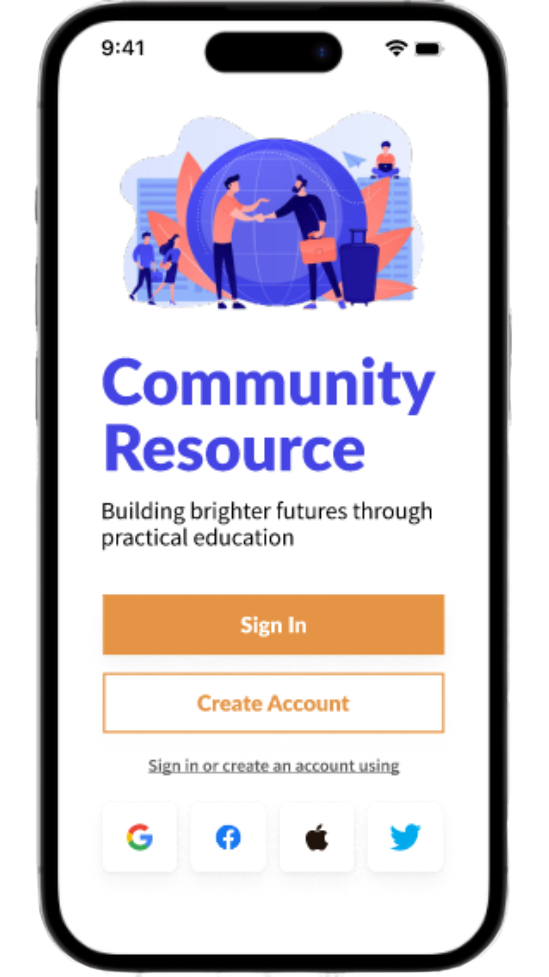
The onboarding screen presents the app's identity with its name and a compelling tagline, establishing a clear app purpose. The "Sign In" button enables seamless access for returning users, prioritizing efficiency. Meanwhile, the "Create Account" button promotes new user engagement, ensuring a streamlined and inclusive onboarding experience.
Creating A New Account
The initial user journey consisted of five screens. When users launched the app, they were first presented with the sign-in/sign-up screen. If users did not have an account, they were expected to click the "Create Account" button, which would lead them to a trio of registration screens with data input fields.
After completing the registration screens, users would reach the login screen, from which they would be prompted to enter their newly created user name and password.
Optimizing Onboarding with Registration Forms
The registration form screens assumed a pivotal role in user account creation. By systematically capturing crucial data points including names and email addresses, it ensured the precision of user profile creation.
Orchestrated with meticulous design thinking, this form was designed to harmonize streamlined onboarding, foster data accuracy and amplify user contentment.
Crafting the Login Screen
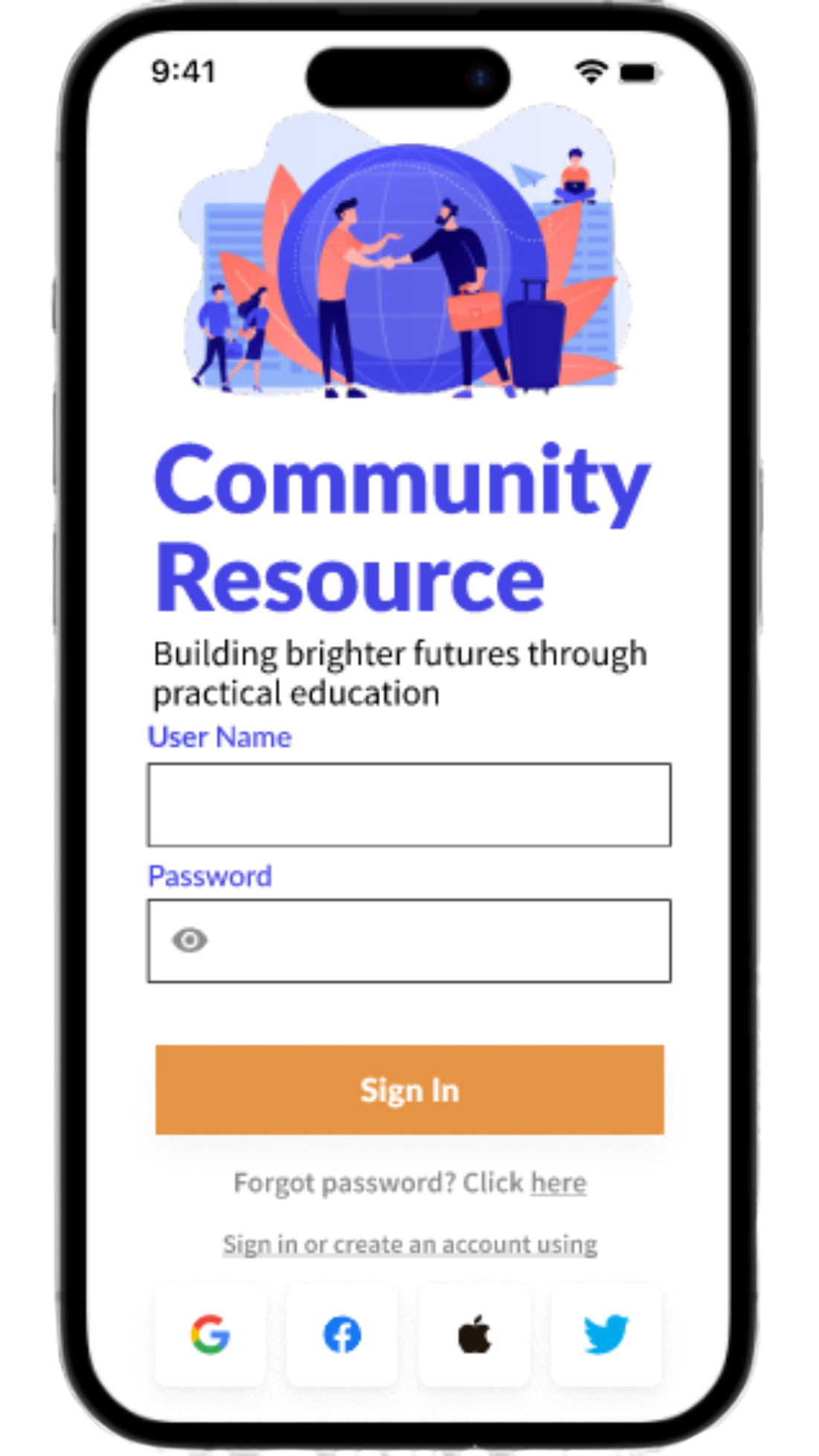
The login screen was designed to serve as the primary gateway, and prompted users to enter their designated username and password. The interface was crafted to ensure secure access to personalized accounts, prioritizing user authentication.
Alex H.
Age: 25
Location: Austin, Texas
Educational Background: Bachelor's degree in Marketing
Occupation: Customer Service Representative
Background
Alex recently graduated and works as a Customer Service Representative. He is determined to kick start his career in marketing and is actively looking for opportunities to gain practical skills and improve their employability.
Goals
To complete the sign-up process and access in-app features.
Frustrations
Encountering difficulty during a sign-up process and feeling overwhelmed by lengthy registration steps.
Motivations
Gaining access to in- app features, services, and content to unlock personalized experiences.
Sarah T.
Age: 35
Location: Denver, Colorado
Educational Background: High school diploma
Occupation: Customer Service Manager
Background
Sarah works as a Customer Service Manager in the retail industry but is looking to make a career change for better opportunities and job stability.
Goals
Sarah aims to efficiently sign up for a mobile app that offers professional development courses, hoping to gain new skills and secure a more stable career path.
Frustrations
Sarah is frustrated by complex and time-consuming sign-up process of mobile apps
Motivations
To unlock valuable resources, enhance her skills, and improve her career prospects.
Usability Study
Usability Study Objective
The usability study evaluated the Community Resource mobile app's sign-up process to identify pain points, usability issues, and areas for improvement. The feedback gathered from participants was used to enhance the user experience and create a more user-friendly sign-up process.
Usability Study Methodology
The usability study was conducted through remote usability testing sessions with a diverse group of 20 participants. Participants were recruited via Linkedin and selected based on their familiarity with creating new user accounts on mobile apps. The testing sessions were moderated by researchers who guided participants through the sign-up process and observed their interactions with the first iteration of the mobile app’s prototype.
Usability Study Findings
Insights from the usability study highlighted design challenges, including absent step indicators during account creation and unclear differentiation between mandatory and optional fields. Additionally, a lack of clear distinction between necessary and optional fields led to information oversight.
Additional insights revealed that users became frustrated as a result of having to navigate intricate account creation steps, faced unclear post-success outcomes, and lacked password visibility, leading to typing errors. Lastly, findings unveiled insights into user flow pain points, including unclear benefits explanation for account creation and an absence of quick registration through existing social media accounts.
Affinity Mapping
The affinity map organized user insights into categories, revealing patterns and pain points. This visual representation aided in deriving design solutions from past user feedback.
Affinity Map Insights
Insights from the affinity mapping session revealed several patterns and pain points. Users struggled tracking progress in account creation, risking confusion. Unclear distinction between required and optional fields led to missed vital info, increasing submission errors, and overwhelming steps and unclear instructions frustrated users, potentially causing abandonment. Additionally, password entry issues and questioned account necessity affected usability. Lastly, lack of quick registration options discouraged streamlined users.
Visual and Field Issues
Insights from the affinity mapping session revealed that the overall user experience of the account creation process is hindered by a lack of visual cues, making it challenging for users to track their progress and potentially causing confusion. Furthermore, the unclear differentiation between required and optional fields leads to missed information and incomplete submissions, compounding frustration.
Usability Woes Unveiled
The account creation process faced usability challenges, including convoluted steps and unclear instructions, causing user overwhelm and potential abandonment. After successful creation, users lacked guidance, causing confusion. Password visibility issues resulted in errors and repeated attempts, leading to frustration.
User Concerns Emerge
Users encountered unclear benefits during account creation, leading to doubts about necessity. Neglecting this could have heightened abandonment or decreased conversions. Additionally, the absence of social media registration concerned users seeking convenience.
Simplified Instruction Integration
Visual cues, such as progress bars or step markers needed to be implemented to improve process clarity. Additionally, it was discovered that required and optional fields should be clearly distinguished using colors or typography. Steps needed to be simplified and include concise instructions as well. Lastly, we discovered that password visibility toggling prevented errors, and that we needed to incorporate personalized content and social media registration for streamlined sign-up.
User Journey Map
The user journey map was created using insights from the initial usability study. The map visualizes user interactions, emotions, pain points, and enhances understanding. Its results aided the design team in identifying areas for improvement, streamlining the user experience, and ultimately leading to a more user-centered design
Refining The Design
Addressing User Pain Points
Enhanced User Guidance
Pain point: Lack of visual cues to indicate the current step in the account creation process.
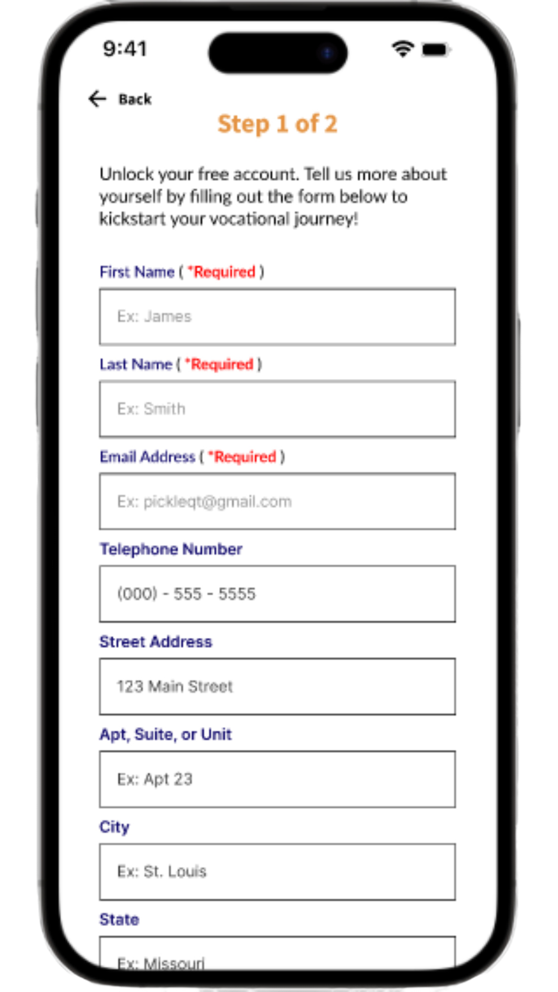
Design solution: Informative cues were integrated into the registration screen, clarifying user progression during the registration process.The intent was to bolster user confidence, reduce uncertainty and to aid users in understanding their current stage.

Clear Field Differentiation
Pain point: Unclear distinction between required and optional fields, causing users to overlook important information.
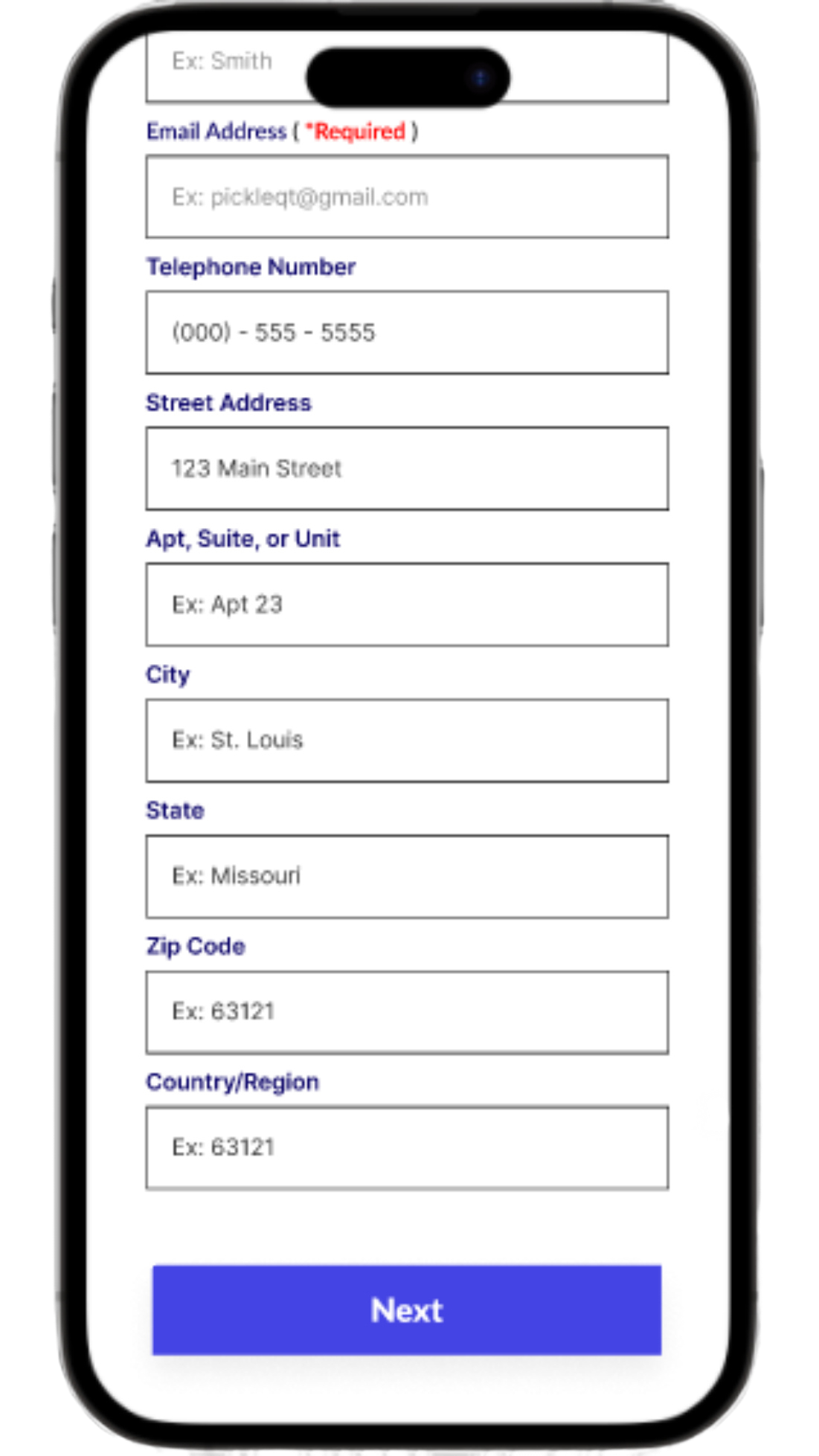
Design Solution: The form's second iteration was improved by introducing clear distinctions between required and optional fields. This UX design enhancement helps users promptly recognize essential information, streamlines data entry, and minimizes errors, ultimately leading to a more user-friendly and efficient form-filling experience.
Streamlined Onboarding Flow
Pain point: Complex and convoluted account creation steps that overwhelm users.
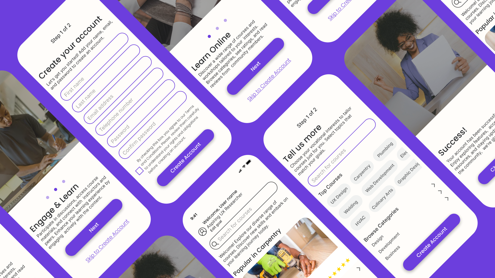
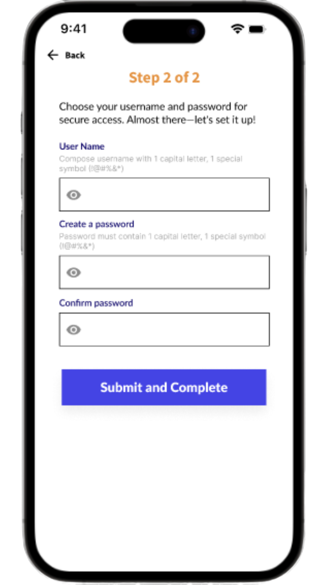
Design solution: User onboarding was refined by reducing registration screens from three to two, increasing efficiency. The "Marital status" input field was removed from the first screen due to its irrelevance. The second screen was completely eliminated, streamlining the process and collecting only essential information for a more effective and user-centered experience.
App Value Clarification
Pain point: No clear explanation of the benefits of creating an account, causing users to question its necessity.
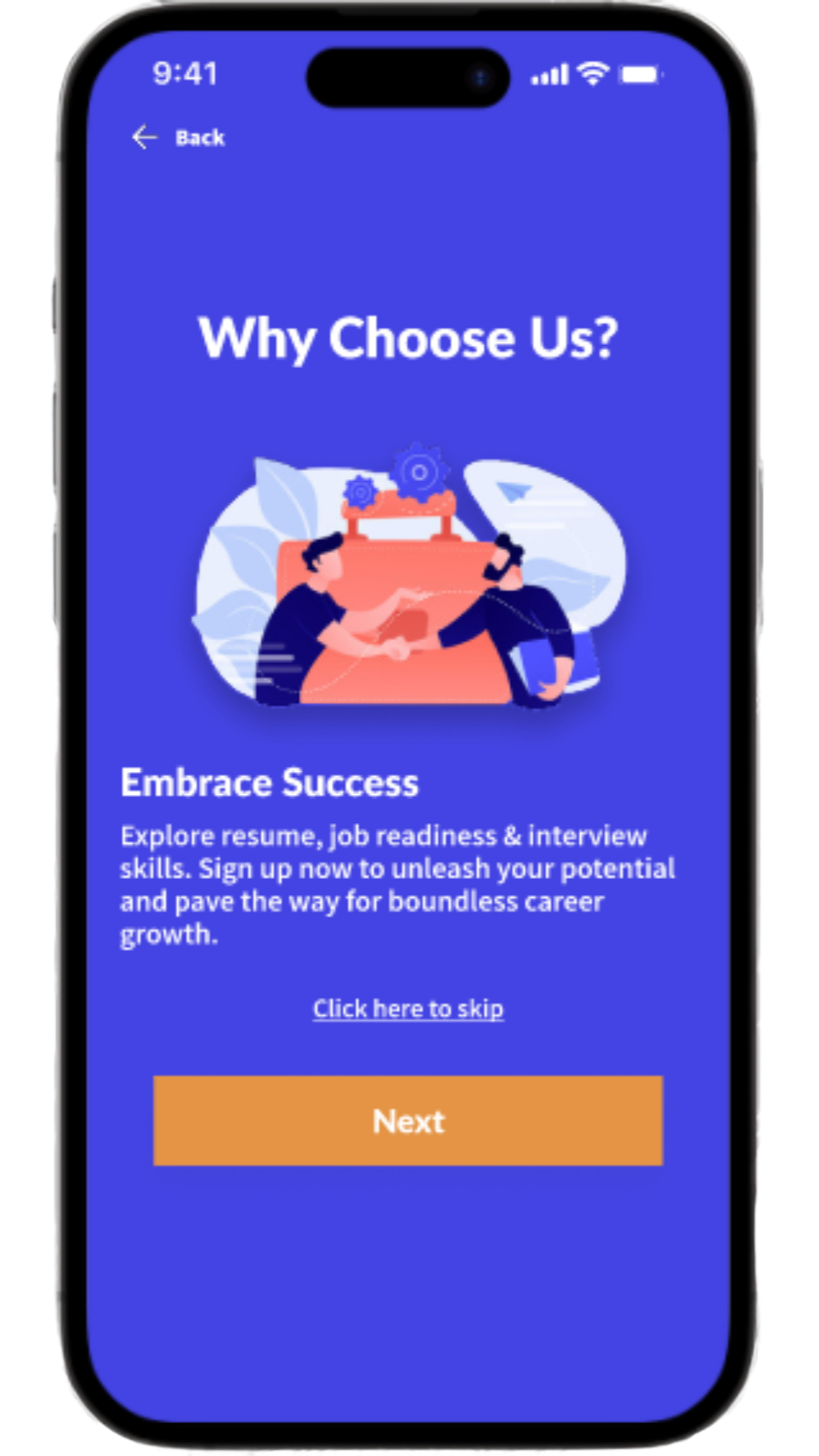
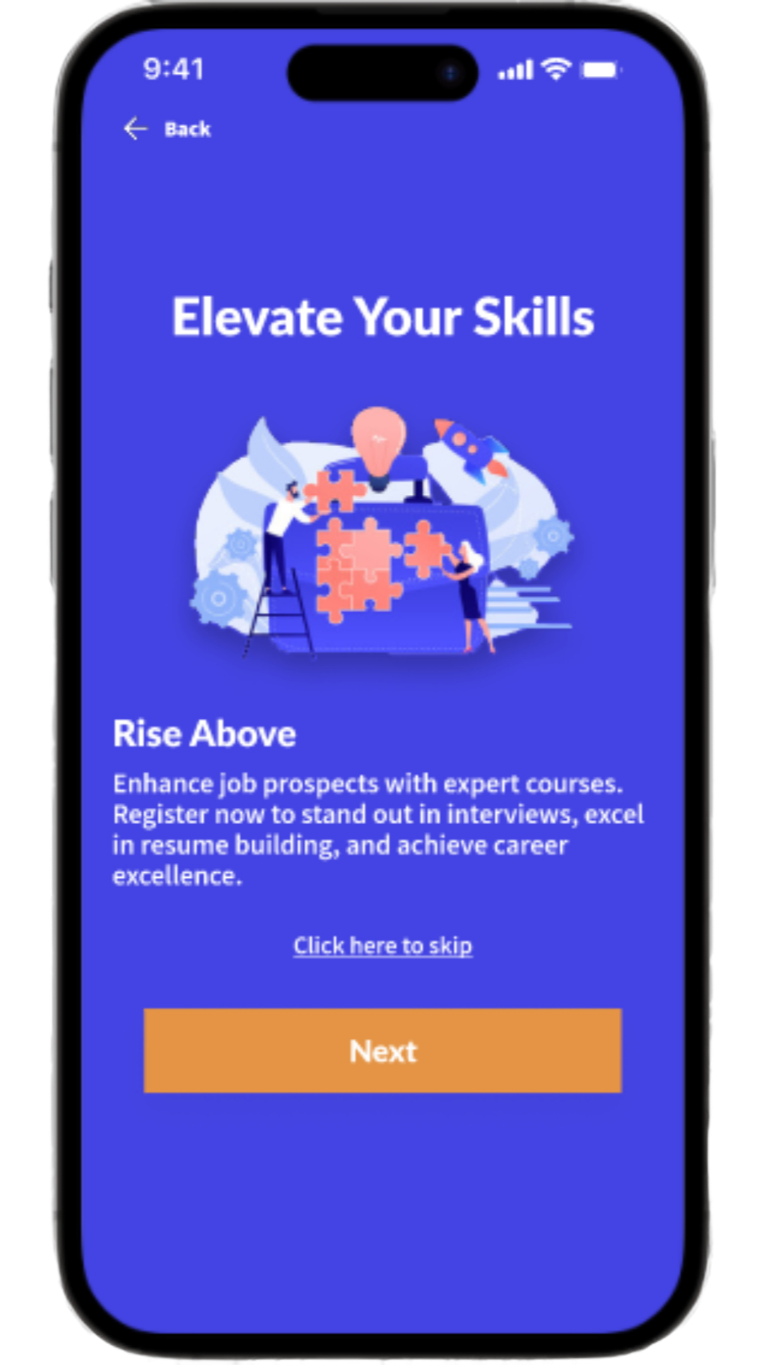
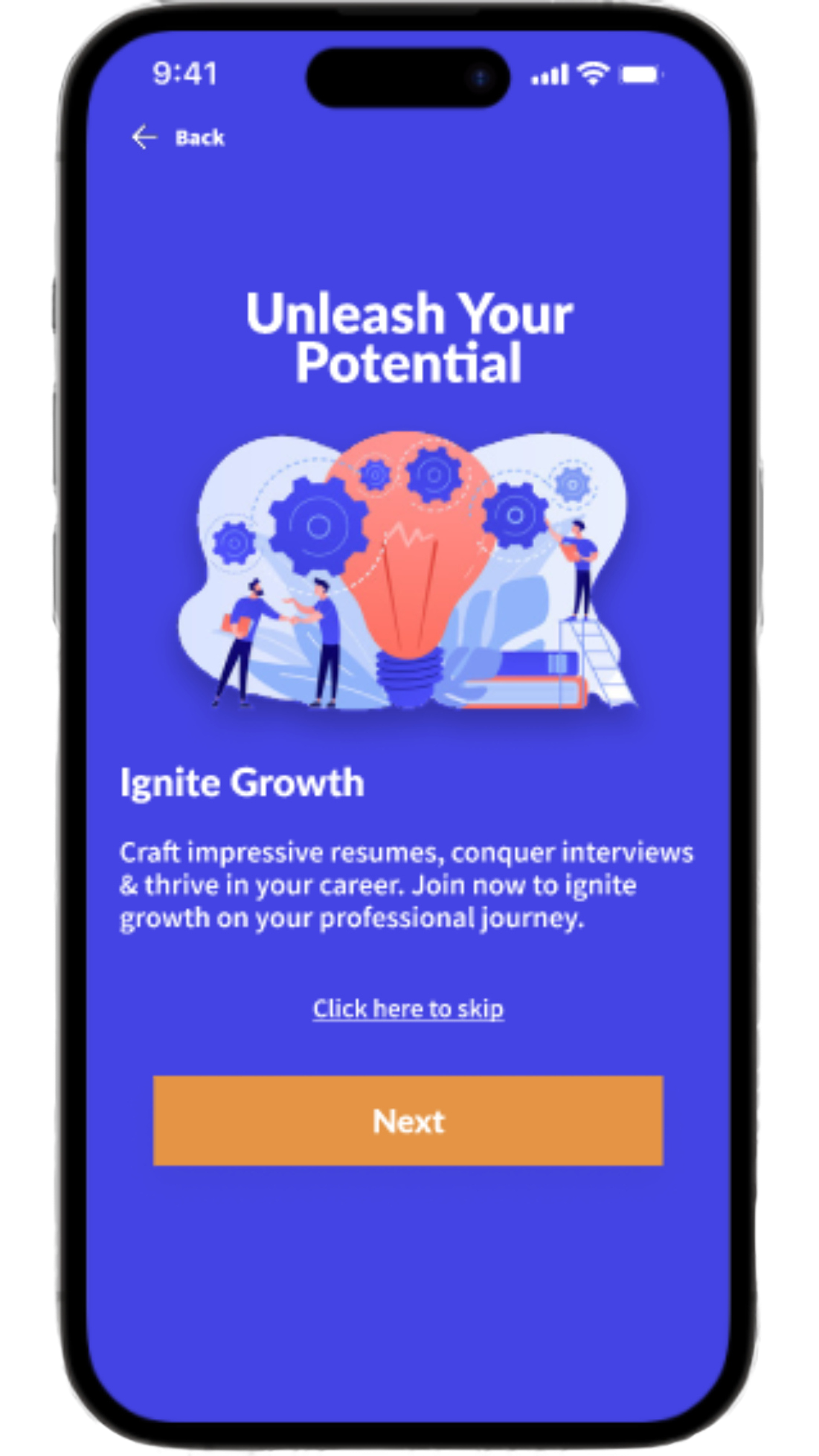
Design Solution: Three supplementary screens highlighting app benefits were incorporated into the onboarding process. This informed users about the app's advantages, fostering a deeper understanding and promoting heightened engagement. As a result, users were better equipped to make the most of the app's features.

Post-Registration Clarity
Pain point: No clear explanation of what happens after successful account creation.
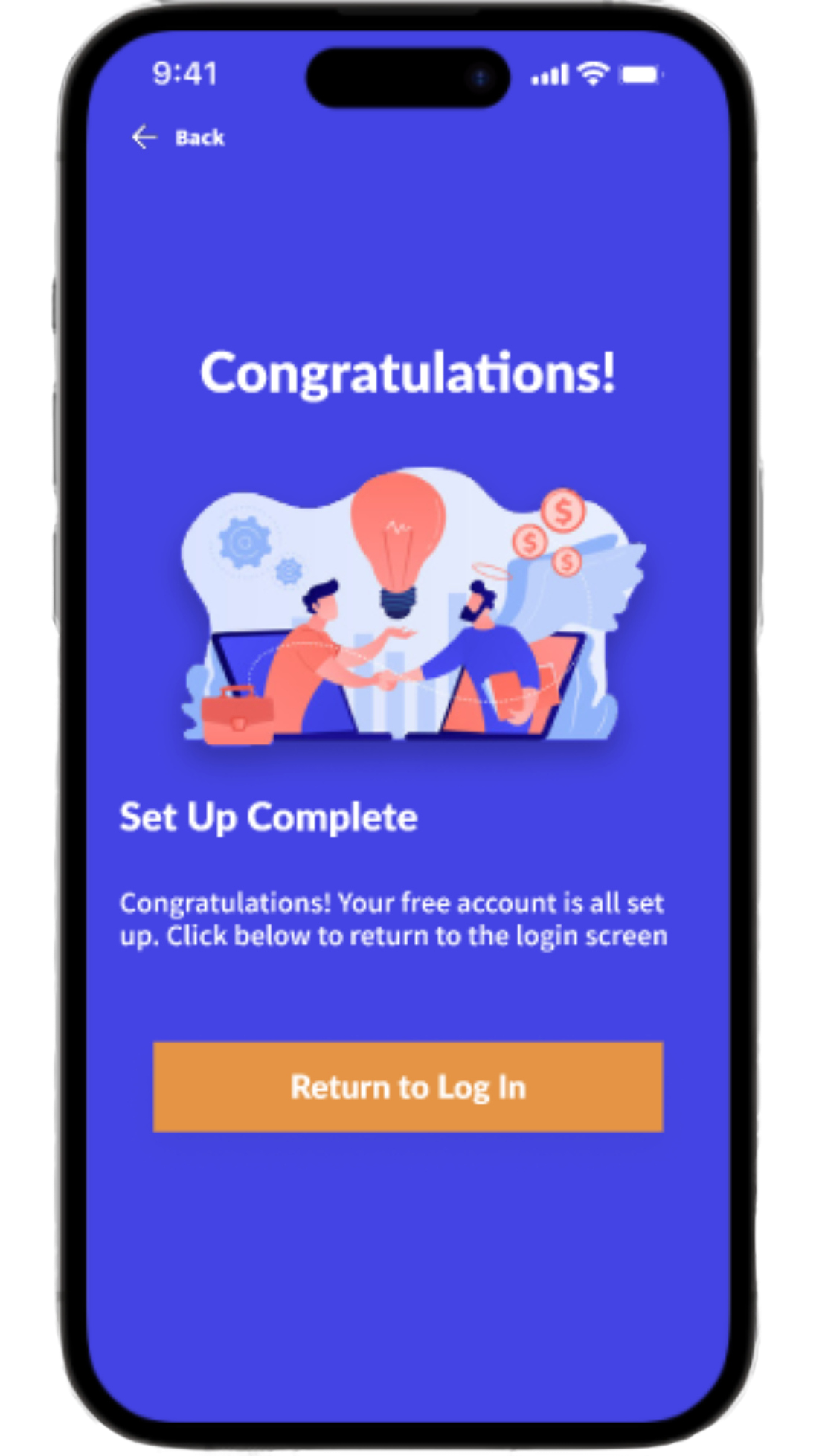
Design solution: A confirmation screen was added to the second iteration of the registration flow to notify users that they had successfully completed the registration process. The addition of the confirmation screen ensured that users felt assured and informed, and served to foster a sense of accomplishment while reducing uncertainty about whether or not they successfully completed the registration process.

Social Sign-In Ease
Pain point: No option to use existing social media accounts for quick registration, deterring users.
Design Solution: The signup and sign-in interfaces were improved by integrating a social sign-in option. This enhancement streamlined user onboarding, leading to quicker registration and login processes. As a result, users enjoyed smoother experiences with reduced friction, demonstrating a commitment to a user-centered approach.

Input Error Prevention
Pain point: No option to view password while typing during account setup, leading to typing errors.
Design solution: The second iteration of the registration flow includes eye icons in the ‘create a password’ and ‘reenter password’ input fields. This design change allows users to to view their inserted text and contributes to a more user-friendly experience by providing increased password visibility to reduce input errors.

Mockups
High-Fidelity Prototype
Usability-Driven Prototype Design
Utilizing insights from usability study and affinity mapping, the high-fidelity prototype embodies a user-centric approach. It aims to ensure a frictionless user journey during account creation, granting access to the app and its functionalities while prioritizing a seamless interaction for prospective users. Interact with the prototype on Figma by clicking the image!
Accessibility Considerations
Accessible Visual Cues
Clear progress and navigation cues aid users with disabilities, ensuring easy understanding of their location within the app.
High Contrast Design
Enhance readability with high contrast aids for users with visual impairments, making content easily distinguishable for improved accessibility.
Accessible Icons and Buttons
Use accessible icons and labels assist screen readers users to promote universal understanding and interaction.
Next Steps
Conduct second round of usability Testing
Identify overlooked issues, validate improvements, and enhance user experience based on fresh insights from real users.
Conduct A/B Testing
Determine which design variation resonates best with users, optimizing engagement, and driving informed design decisions.
Content Refinement
Ensure clear, concise content aligns with user expectations, enhancing comprehension and user satisfaction.
Takeaways
Impact
Optimizing the Community Resource app's sign-up process elevates user adoption and retention rates. Through user-centric design, onboarding becomes frictionless, granting users effortless access to vocational courses. This intuitive experience not only amplifies registrations but also cements the app's pivotal role in democratizing digital vocational education.
What I Learned
While creating and designing Community Resource’s sign-up process, I learned the profound impact of simplification. Reducing steps, updating visuals, and delivering intuitive feedback were critical. I discovered the necessity of straightforward instructions, user-friendly security measures, and the value of a guest mode. I also learned the importance of ensuring a coherent user flow and clear post-sign-up directions deepened my understanding of crafting user trust and smooth transitions.


