Project Overview
The Product:
Ponder Museum’s mobile app provides users with details about exhibits, artifacts, and artwork, offers information on membership plans and pricing, and provides updates about upcoming events, workshops, lectures, and more.
Project Duration:
January - March, 2023
The Challenge:
The challenge for this project was to create a seamless user flow that allowed users to view, learn more about, and select a museum membership plan that works best for them by crafting intuitive pathways, clear calls-to-action, and informative content to promote user engagement and conversions.
My Role
UX Design, User Research, Information Architecture, Usability Testing, Prototyping and Wireframing.
The Goal:
The goal of this project was to create a user-friendly experience that allowed users to purchase a museum membership plan by providing comprehensive details about the differences in plans, as well as intuitive interactions to make it easier for users to make informed decisions.
Responsibilities:
Conducting thorough user research to inform design decisions, implementing logical and user-friendly content organization, executing usability tests, gathering feedback to validate design solutions for seamless and intuitive user experience, and creating interactive prototypes and wireframes for effective communication and iterative design refinement.
Starting The Design: Digital Wireframes
Starting The Journey
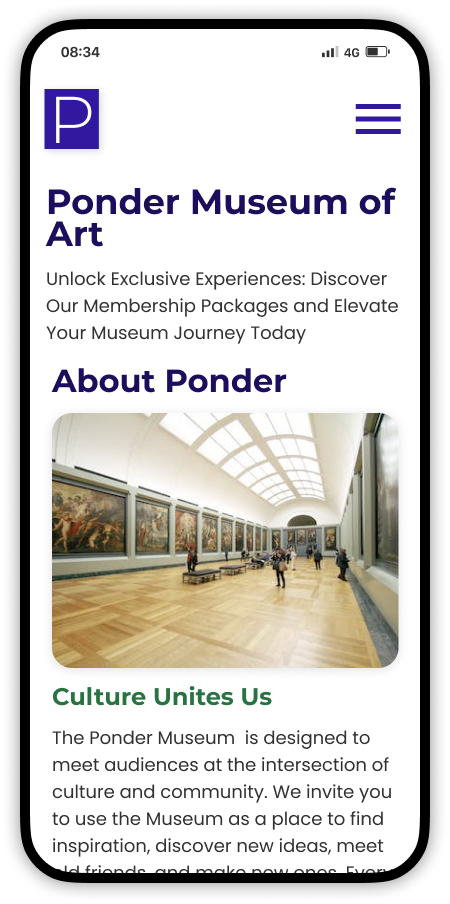
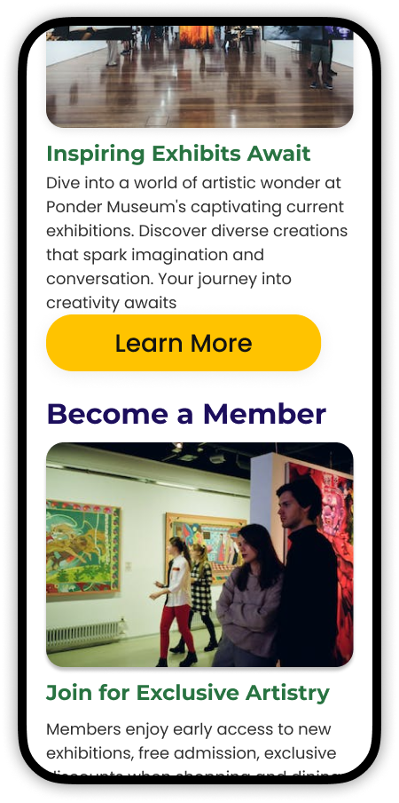
The user's journey commenced as they landed on Ponder Museum's homepage. Presented with options to discover museum insights, explore exhibits, and access membership details, the interface primed for an immersive and user-centric encounter, enhancing the overall UX of the museum exploration.
Tiered Membership Exploration
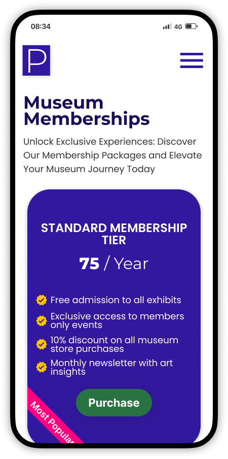
The museum membership screen acquaints users with Ponder's multi-tiered membership choices. This interface supplies comprehensive details about each membership tier, enabling users to seamlessly delve deeper into their preferred option through intuitive navigation, fostering a user-centric and informative interaction.
Tier Insight Ease
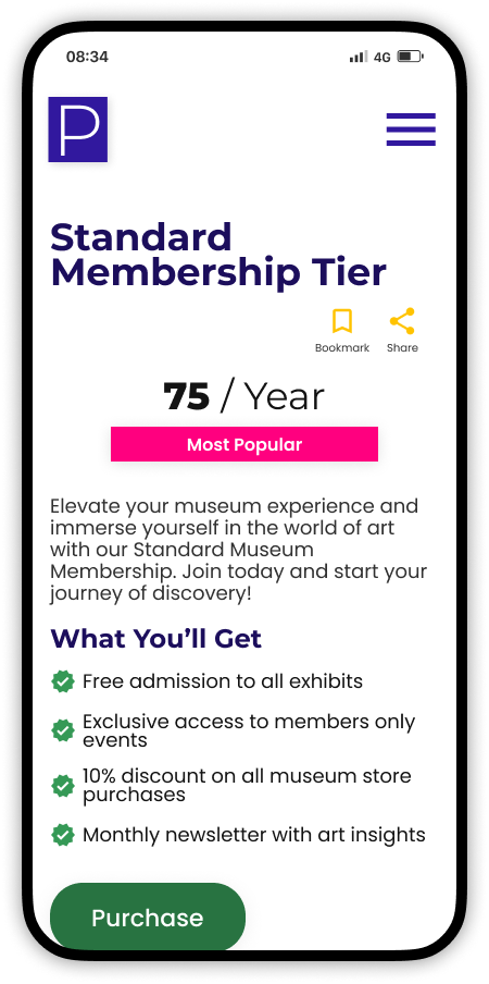
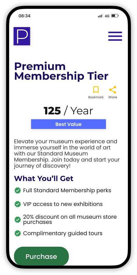
The membership tier information screen offers users a comprehensive view of the user’s chosen membership along with its price and features. A prominent CTA button facilitates user interaction and engagement. Additionally, users can bookmark and share the membership details, enhancing convenience and user engagement in their journey.
Understanding The User : User Research
User Research: Summary
Ten participants were recruited via dscout to participate in the user research for this project. Surveys and interviews were conducted to provide members of the research team with insights related to the pain points participants encountered during past instances of purchasing memberships online through the use of a mobile app.
User research found that participants, in the past, had difficulty understanding membership tiers due to unclear benefits, and were frustrated with hidden terms, and unintuitive menu structures.Further, pricing confusion arose from unclear tier differences, and inconsistent confirmation messages and a lack of guest checkout options led to abandonment. Lastly, complex checkout steps, hidden membership pages, and promo code applications exacerbated user frustrations.
User Research: Pain Points
During the user research, participants were asked to recount past instances in which they’d purchased memberships online either on the web or through the use of a mobile app. Participants cited that past interactions with purchasing memberships plans found that membership tiers were unclear, critical terms were hidden, and that menus lacked logical grouping. A complete list of the pain points users encountered is listed below.
Design Pain Points:
Unclear Membership Tiers: Users were confused by presentation of membership tiers, making it difficult to understand the benefits of each.
Hidden Terms and Conditions: Users missed critical membership terms and conditions due to poor placement within the app.
Unintuitive Menu Structure: Menus weren’t logically grouped.
Usability Pain Points:
Confusing Pricing: Lack of clarity regarding pricing tiers and differences made users uncertain about the best choice.
Inconsistent Confirmation: Users weren't sure whether their membership purchase were successfully confirmed due to a lack of clear confirmation messages.
No Guest Checkout: Some users were required to create an account before purchasing, leading to abandonment by those who preferred a guest checkout.
Unintuitive Progress Tracking: Lack of a clear progress indicator during the purchase process left users uncertain about how many steps were left.
User Flow Pain Points:
Unclear Membership Benefits: Users didn't have a clear understanding of the benefits associated with each membership tier.
Complex Checkout Steps: The membership purchase process involved too many steps, leading to user fatigue and abandonment.
Hidden Membership Landing Page: Membership pages were buried within the app's navigation, making it hard to find.
Hidden Promo Codes: Users aren't sure where to apply promo codes for membership discounts.
User Personas
User personas were created by conducting in-depth user research, which included interviews and surveys. The resulting data was analyzed to identify different user types with similar experiences, needs, and goals. The personas were validated with stakeholders to ensure that they were accurate and representative of the target audience. The personas were then used to guide decision-making throughout the design process.
Emily W.
Age: 29
Location: Seattle, Washington
Educational Background: Master's degree
Occupation: Software Engineer
Background: Emily is an experienced software engineer who works for a tech company in Seattle. She has a keen interest in technology and always keeps up with the latest trends in software development. In her free time, she enjoys working on side projects and exploring new apps.
Goals
Emily is interested in finding a mobile app that offers a tiered membership plan that aligns with her interests. She wants to have access to advanced features that can help her improve her coding skills and stay updated with the latest programming languages.
Frustrations
Emily gets frustrated when apps have complex and confusing user interfaces. She finds it irritating when the signup process is convoluted and requires too much personal information
Motivations
Emily seeks a membership-based mobile app offering coding tutorials, challenges, and lessons. As a software engineer, she desires a platform to enhance skills, learn new techniques, and access advanced features.
Maria S.
Age: 35
Location: Miami, Florida
Educational Background: Associate's degree in Graphic Design
Occupation: Freelance Graphic Designer
Background: Maria is a creative and independent graphic designer who runs her own freelance business. She's always on the lookout for tools and resources that can enhance her design projects. She enjoys networking with other designers and sharing her work on social media.
Goals
Maria is looking for a mobile app that offers a membership plan catering to graphic designers like herself. She wants access to a library of design assets, tutorials, and templates that can help her streamline her design process and create more impactful visuals for her clients.
Frustrations
Maria gets frustrated when apps lack customization options or have limited resources related to graphic design. She's sensitive to app aesthetics and values clean and visually pleasing interfaces. Lengthy and complicated checkout processes deter her from completing a purchase.
Motivations
Maria is motivated by the prospect of discovering an app that can serve as her go-to resource for design materials and inspiration. She wants the membership purchase process to be straightforward and the app's design to be aligned with her creative sensibilities, making her feel inspired to engage with the app regularly.
Usability Study
Usability Study: Objective
The objective of the usability study was to evaluate the efficacy of the first iteration of the project’s design, usability, and user flow and the impact they had on users ability to access, learn more about, and purchase a Ponder Museum membership plan. Satisfying the objective required the research team to review the pain points uncovered during the user research to ensure that they weren't present within the first iteration of the prototype used in the usability study's first round of testing.
Usability Study: Methodology
The usability study employed remote usability testing sessions to evaluate the overall user experience of the prototype's first iteration. A group of ten participants were recruited via Linkedin and Dscout, and were selected based on their prior experiences in using websites or mobile apps to purchase membership plans,ensuring a relevant user perspective.
Testing sessions were moderated by members of the research team, who guided participants through the product's flow with respect to viewing, learning more about, selecting, and purchasing a museum membership plan. Participants' interactions with the first iteration of the prototype were observed, allowing for the identification of usability issues and insights into user behavior. This methodology aimed to gather comprehensive feedback to inform the iterative design process.
Usability Study: Findings
The usability study uncovered various design issues in the app. These included inadequate spacing, which caused accidental clicks; poor use of whitespace, which resulted in cluttered screens; and unclear indicators for selected items on the membership comparison page. Additionally, usability problems included unclear pricing and membership details, a lack of progress indicators during multi-step processes, and an excessive amount of text in plan descriptions.
User flow difficulties also emerged, such as problems accessing the cart/checkout after making selections, locating member discounts, and effectively sharing plan details with others. Addressing these findings is a pivotal step in enhancing the overall app user experience and facilitating smoother interactions.
Affinity Mapping
The affinity map organized user insights into categories, revealing patterns and pain points. This visual representation aided in deriving design solutions from past user feedback.
Affinity Map Insights
Affinity mapping shed light on several vital UX challenges. Inaccurate platform interactions were often driven by inadequate spacing, causing user frustration. Additionally, poor whitespace utilization resulted in an overwhelming user interface, discouraging exploration. Clarity issues arose from ambiguous pricing and overly verbose content, which decreased trust and hindered comprehension. Furthermore, the difficulty in sharing valuable plans impeded organic promotions, emphasizing the need for more streamlined shareability options. Addressing these insights significantly improved the user experience.
Layout and Design
Poor layout design, characterized by inadequate spacing, leads to accidental user clicks, while inefficient whitespace usage results in cluttered, overwhelming screens, compromising user experience and interaction.
Content Clarity
Unclear pricing and verbose plan descriptions impaired the overall user experience, and highlighted the importance of elevating content clarity in design ensures a seamless, intuitive user journey, fostering trust and enhancing decision-making efficiency.
Sharability
Limitations in sharing plan details could lead to a hindrance in organic growth and engagement. Strengthening shareability functionalities within the design would promote virality, enhances user satisfaction, and amplifies word-of-mouth recommendations.
User Journey Map
The user journey map was created using insights from the initial usability study. The map visualizes user interactions, emotions, pain points, and enhances understanding. Its results aided the design team in identifying areas for improvement, streamlining the user experience, and ultimately leading to a more user-centered design.
Refining The Design
Addressing User Pain Points
Accidental Click Prevention
Pain points: Insufficient spacing between elements led to accidental clicks. Screen clutter from poor whitespace use hindered user experience, and unclear indicators for selected items resulted in confusion during navigation.
Design Solutions: Spacing was adjusted, preventing accidental clicks and frustration. Whitespace strategically allocated, enhancing content prioritization and visual clarity. Clear, consistent visual indicators improved item selection recognition and user guidance.
Frustration from Ambiguity
Pain Points: Unclear pricing and membership details resulted in frustration. Additionally, lengthy membership plan descriptions overwhelmed users with excessive text, which hindered understanding.
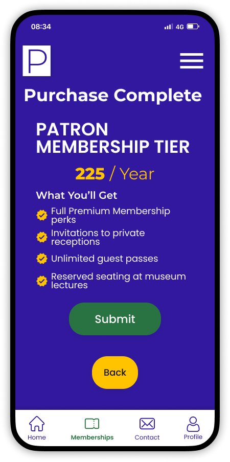
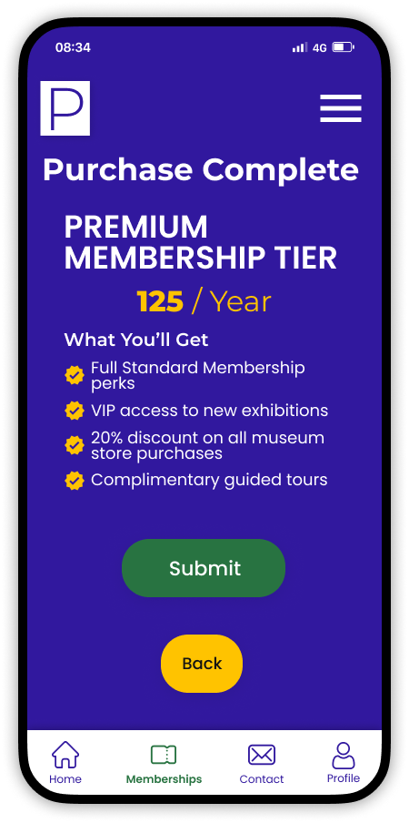
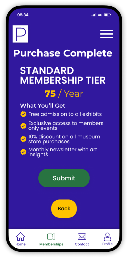
Design Solutions: The redesigned interface prominently displays pricing and tier features with concise plan summaries to simplify key benefit highlights.
Checkout & Sharing Issues
Pain Points: Users struggled with accessing checkout due to unclear pathways. Additionally, sharing membership plan information with others proved to be inconvenient, highlighting usability issues in accessing, comprehending, and sharing essential membership-related information.
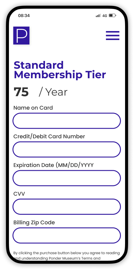
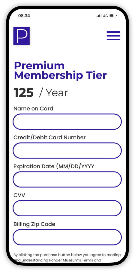
Design Solutions: A distinct 'Continue to checkout' button was added, guiding users to the next purchase step. A designated discounts section on membership details displayed clear headings for easy visibility. Integrated social sharing buttons enabled users to effortlessly share membership information across platforms, boosting referrals.
Mockups


High-Fidelity Prototype
Usability-Driven Prototype Design
Utilizing insights from usability study and affinity mapping, the high-fidelity prototype embodies a user-centric approach. It aims to ensure a frictionless user journey during the membership viewing, selection, and purchasing flow by prioritizing seamless interactions for users.
Accessibility Considerations
Clear Font Sizes
Include legible text benefits users with visual impairments, ensuring easy reading of membership details.
Progress Indicators
Enhance visual and text-based cues offer step-by-step guidance for users with cognitive impairments during the membership purchase process
Inclusive Payment Options
Incorporate a range of payment methods benefits users with varying abilities, ensuring seamless membership purchase experiences.
Next Steps
Visual Hierarchy Enhancement:
Improving visual hierarchy directs users' focus, highlighting essential content, guiding them through exhibits, events, and membership options effectively.
Comparison Chart Clarity
Improving membership comparison charts aid users in making informed decisions, clarifying plan differences for better selection understanding.
Inclusive Usability Testing
Implement testing with individuals with disabilities to ensure an accessible and user-friendly experience by addressing diverse needs and enhancing overall usability.
Takeaways
Impact
The impact of an intuitive user flow that enables seamless exploration, comprehensive information access, and effortless membership purchase within the Ponder Museum app will significantly elevate user-friendliness, fostering engagement, satisfaction, and conversions.
What I Learned
Through the process of developing this feature, I learned how to create user-friendly pathways, make information easily discoverable, and turn actions into seamless experiences by testing and refining.


